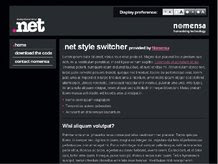
Our colleagues over on .net magazine, the world's best-selling magazine for web designers and developers, love nothing more than getting down and dirty with a chunk of source code.
Their website features a wealth of information for site builders covering subjects such as CSS, JavaScript, PHP, and more.
Here are five of their CSS tutorials that you can use to quickly and easily improve your website. None of these projects take more than around 20 minutes to complete.
Hit the links below for the full tutorials and support files.
1. Code flexible layouts
Nowadays a screen resolution of 1,024x768 can be considered 'standard', thereby providing more space, particularly in terms of width, for site designs. This is also a time where we're continually hammered with information, and clients regularly demand that you simultaneously show about 40 billion different things on the websites you're creating for them. Flexible CSS-based layouts, based on an underlying grid and gutter structure, for information-heavy sites that are packed with content, flexible layouts could be your answer.
Read Code flexible layouts
2. Transform your type by using a baseline grid
A baseline grid is something that forces text to adhere to the spacing in a ruled pad. Vertical rhythm is maintained down the page, which is particularly handy for books because the words on one page won't be visible in the gaps between the lines overleaf. However, it also results in great spacing that's easy on the eye. The printing issue isn't that relevant online, but rhythm is - text can be hard to read onscreen, so any method that can make this process easier is worth investigating.
Read Transform your type by using a baseline grid
3. Build a scalable graphical navigation bar
In this tutorial the writer explores a graphical navigation bar that's akin to the one on Apple.com, but that's not constructed using fixed images. Instead, it utilises a HTML list (with HTML text for the list item content, meaning the text can be zoomed), plus CSS for styles, including background images.
Read Build a scalable graphical navigation bar
4. Create site maps using lists
Typical site maps are lists of sections, often housing sub-sections, which in turn may house their own sub-sections. Although a vector-based drawing is a perfectly good means of illustrating such a thing, so too is a basic bullet-point list, with indented items representing sub-section content. The only issue with a bullet-point list is that the relationship between pages and their siblings isn't terribly clear, but - as the CSS-savvy will be aware - HTML lists are pretty versatile and can be styled in many different ways, bringing some visual panache and usability to what was originally just a bunch of black blobs and words.
Read Create site maps using lists
5. Switch site styles with ease
Imagine everyone on the planet knowing how to resize text using their browser. Bliss! But unfortunately they don't - an international advertising campaign would be required to even make a dent. Not only do people lack the knowledge of how to resize text, the majority don't know that it's even possible, so they don't look for 'how to' information. So why not include a style switcher on your site? Here's how.
Read Switch site styles with ease
--------------------------------------------------------
If you like this post please Bookmark it and comment bellow. To recieve new updates and other posts like this please subscribe via RSS or via Email.


0 comments:
Post a Comment